Brand & Creative Challenges
ABOUT
I'm No Chessman, a contemporary alt-rock band hailing from the sunny shores of Bournemouth, their music is driven by a desire to create an experiential journey for their audience.
Established in 2011, I'm No Chessman has carved out a unique space in the music industry as an independent band, their creative prowess has resulted in the release of three highly acclaimed albums, with the fourth eagerly anticipated.
I'm No Chessman effortlessly embraces their modern rock sound, crafting a sleek and grooving composition that packs the necessary punch and crunch to transcend the landscape of post-rock.
BRANDS MISSION
I'm No Chessman's mission is to propel the brand to new heights, expanding their reach and garnering greater recognition.
Striving to grow their presence in the music industry, captivating audiences with their unique contemporary alt-rock sound, and by crafting captivating and emotive songs, they aim to create a lasting impact on listeners, leaving an indelible mark on the music industry.
CLIENT NAME
I'm No Chessman
Facebook
Website
Instagram
Youtube
Industry
Music, Entertainment
TARGET AUDIENCE
Music enthusiasts
Gender: ALL
Age: 20 - 40
Interests: Early 00 Punk rock music, Alt-rock music, punk rock music
PROJECT
In a quest to transcend the ordinary and make a profound impact in the pop-punk rock scene, I embarked on a transformative journey of helping to rebrand the band
I designed compelling visuals that conveyed I'm No Chessman's rebellious spirit, raw authenticity, and unwavering dedication to their craft.
Through carefully crafted imagery, I aimed to forge a deep connection between the band and their fans, fostering an unbreakable bond, from album covers and merchandise designs to social media graphics and stage backdrops, every piece of art was meticulously crafted to ignite the imagination and leave a lasting impression on their audience.
BRAND GOALS
Build Brand Awareness, Brand Recognition, Build Brand Strategy, Build a Relationship with their Audience
Services
Logo Design, Video Content Design, Video Content Strategy, Email Design, Banner Design, Poster Design, Social Media Visual Communication Design, Artwork Design, Album Art Design
Logo Design
Moodboard
Direction
Through a careful analysis of their values, aspirations, and target audience, I aimed to create a logo that would not only captivate but also resonate with the brand's unique personality.
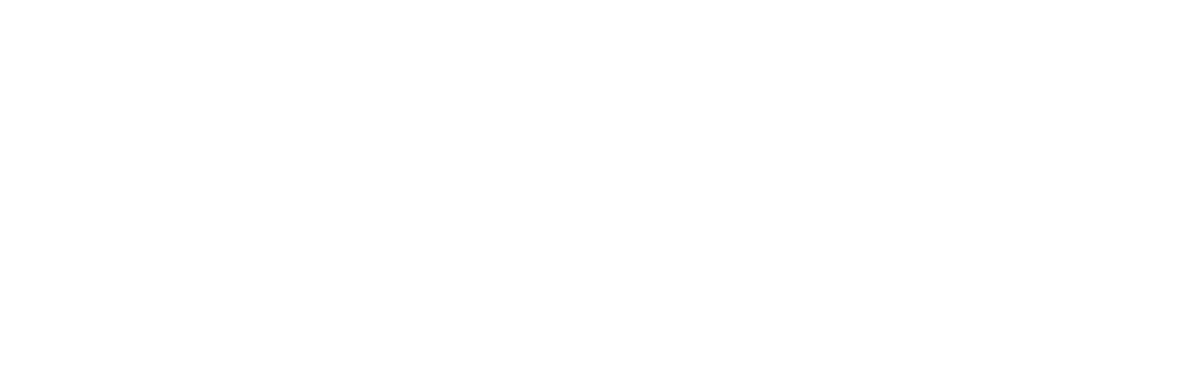
Beyond the traditional letterform, I wanted to create a logo mark that would serve as a memorable symbol, the letter "C" from the word "Chesman" stood out as an ideal candidate for this purpose, offering the potential to craft a visually striking and instantly recognizable emblem.
Brand Words
Modern, Bold, Punk, Pop, Dynamic, Scaleable
WORDMARK
Logo Icon


At the heart of the Chessman brand lies a captivating logo wordmark and logo icon, meticulously crafted to represent the brand's essence, with a simple yet striking icon design and a custom-created typeface, this logo exudes a timeless appeal that resonates with the brand's identity.
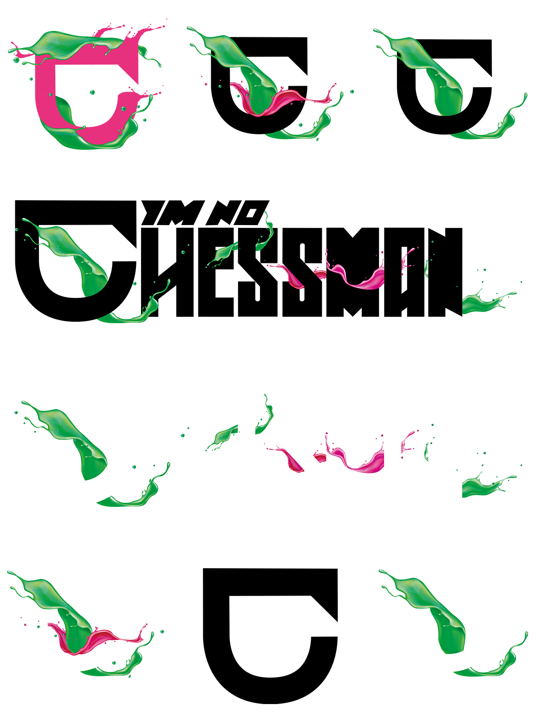
Throughout the logo design process, simplicity, scalability, and adaptability were the guiding principles, each aspect of the logo was meticulously considered to ensure its ability to transcend various mediums and brand expressions.
Embracing the philosophy of minimalism, the icon was intentionally kept simple, yet impactful, this deliberate choice not only enhances its versatility but also makes it ideal for various applications, such as tattoos.
Logo Variation and Logo Adaptability
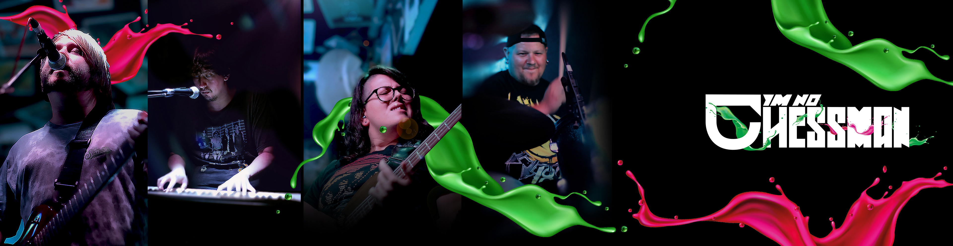
Visual Branding & Communication Design
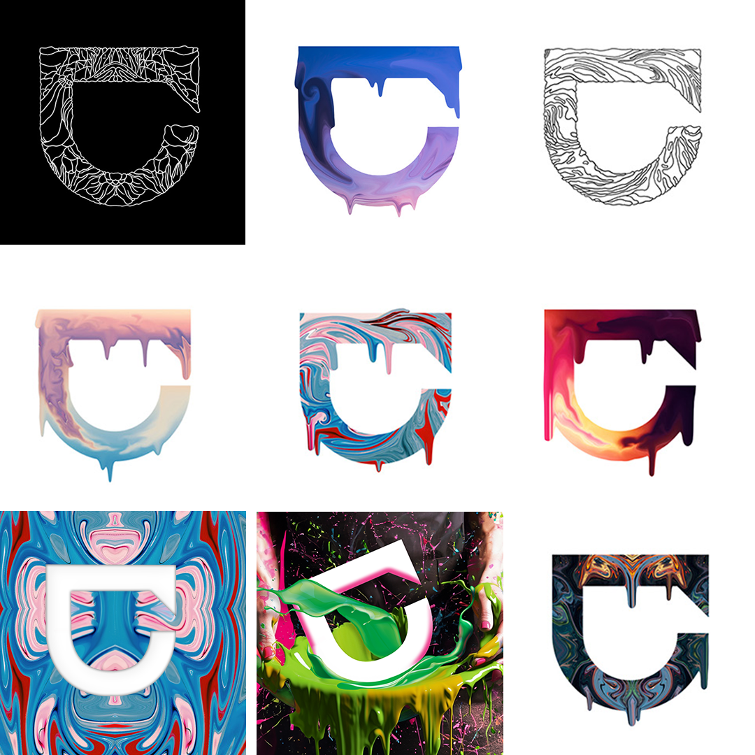
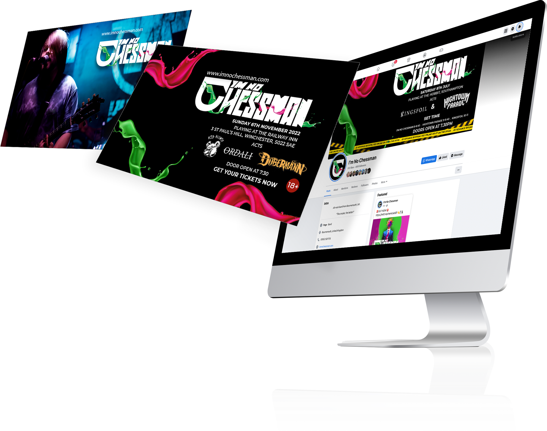
Social Media
Creating a cohesive visual communication language plays a pivotal role in establishing a brand's identity.
The clever utilization of colors and composition holds tremendous significance, in this case, the incorporation of the pink and green splashes served as arrows, guiding the viewer's eye toward the essential elements of the design.
The deliberate choice to keep the composition simple ensured that all information was presented clearly, making it easily accessible to the viewer.
Capturing the viewer's attention is crucial in the fast-paced world, by employing engaging and popping visuals the designs quickly captivate the viewer's gaze, compelling them to explore further.

Visual Art Design
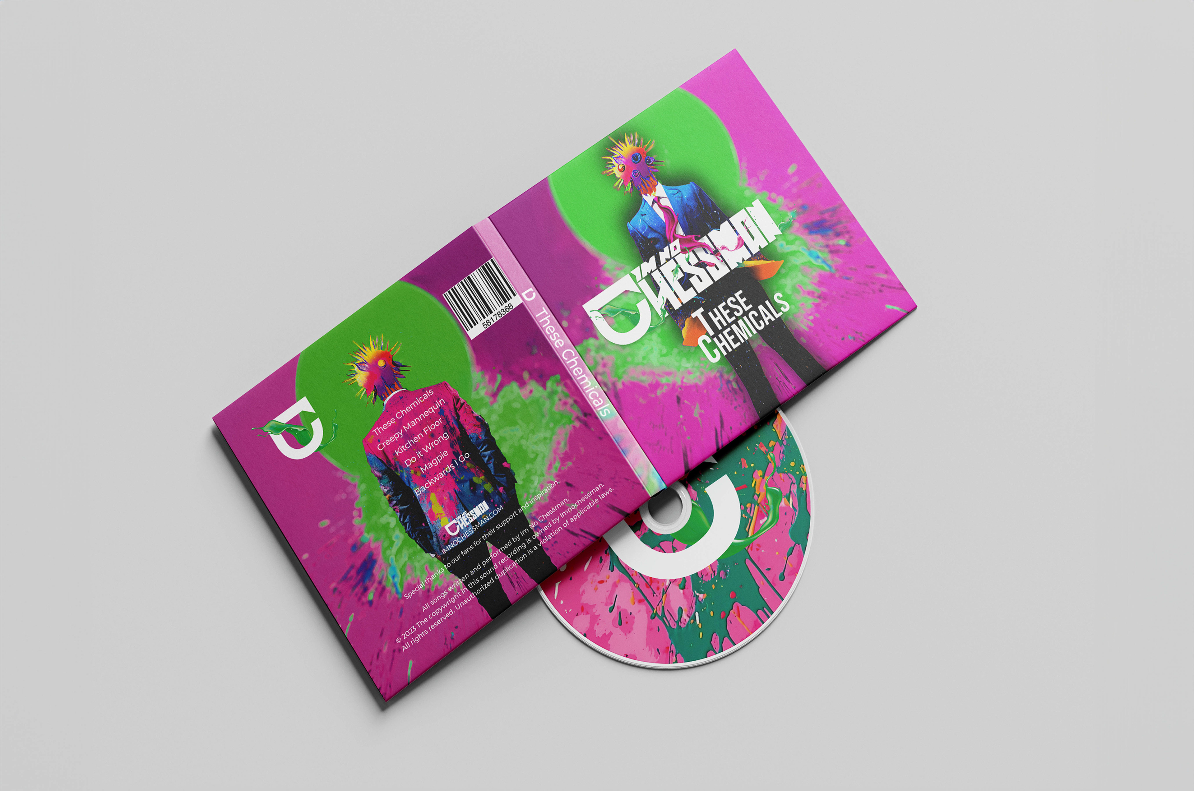
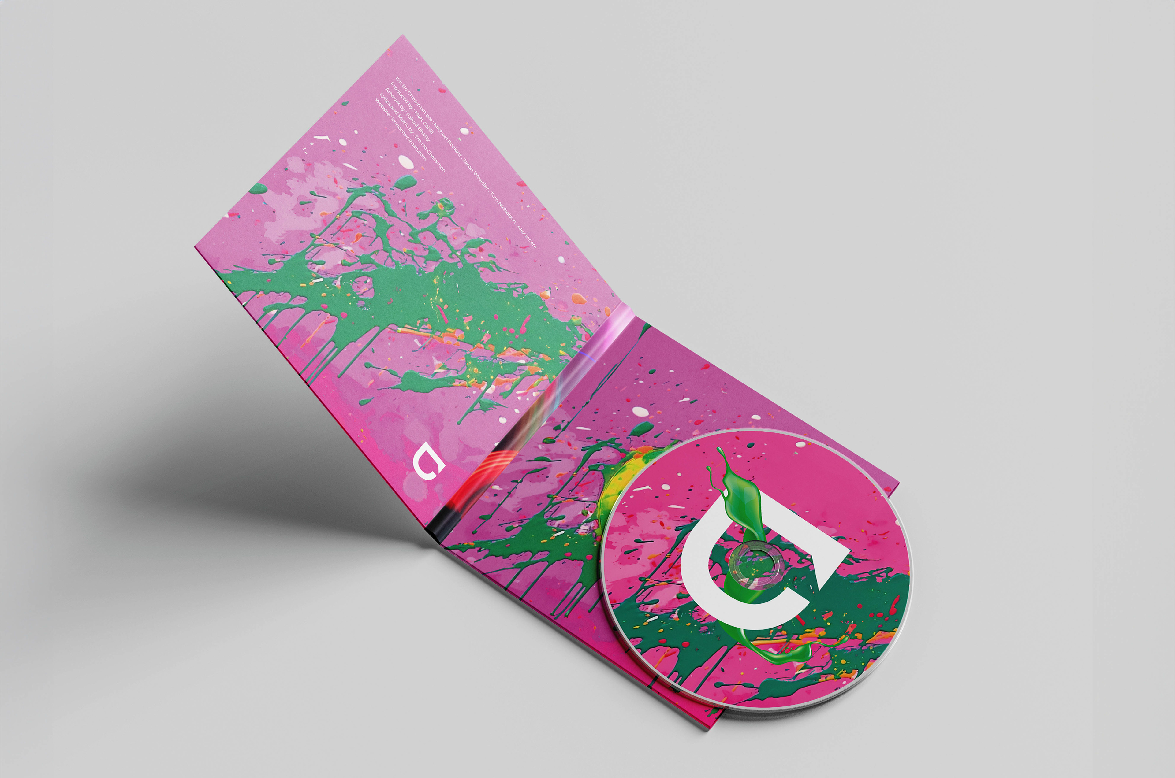
ALBUM ARTWORK
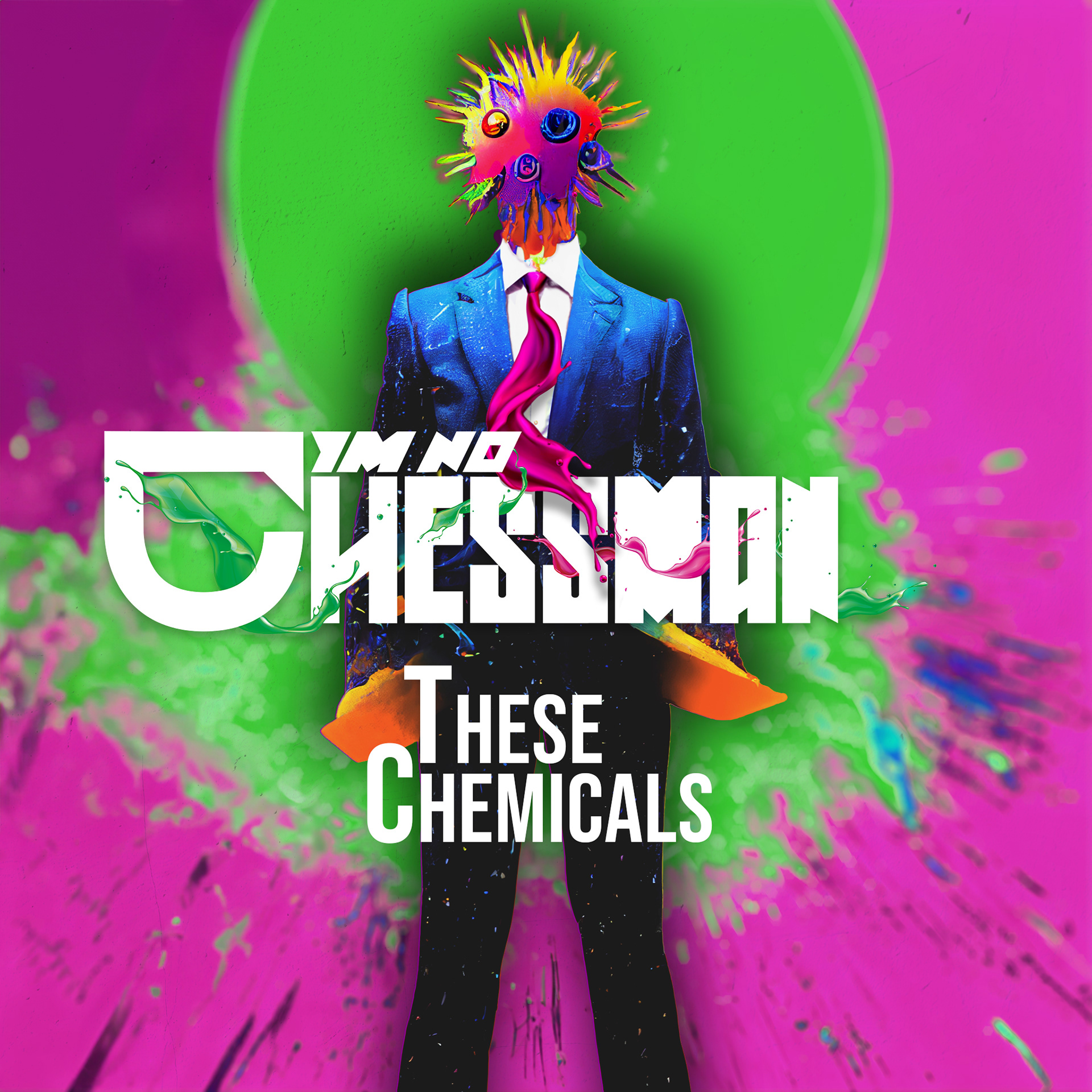
A Harmonious Blend of Art and Brand Identity, understanding the essence of the brand was critical in translating their identity into the album art, delving into the meaning behind the album, I aimed to captivate the attention of potential listeners and ignite their curiosity.
The album art for "These Chemicals" brilliantly portrays the juxtaposition of chaos emerging from structure. A suited man with his head exploding into a vibrant and chaotic array of colors symbolizes the album's essence.
The artwork was designed with versatility in mind, from print media to physical CD covers, digital promotional material, and banners, this ensured a seamless transition across various mediums, maintaining visual consistency and maximizing the impact of the album's artwork.